Behind-the-strings work to improve the user experience
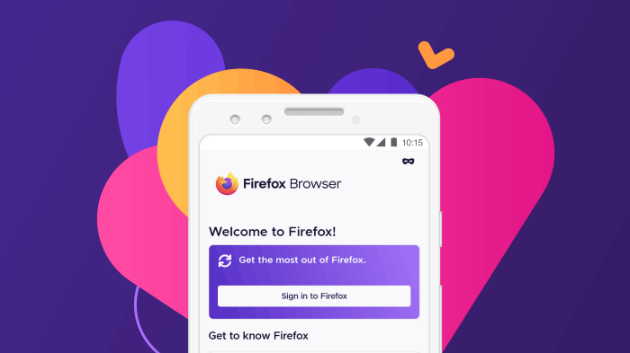
The Firefox for Android team recently celebrated an important milestone. We launched a completely overhauled Android experience that’s fast, personalized, and private by design.
When I joined the mobile team six months ago as its first embedded content designer, I quickly saw the opportunity to improve our process by codifying standards. This would help us avoid reinventing solutions so we could move faster and ultimately develop a more cohesive product for end users. Here are a few approaches I took to integrate systems thinking into our UX process.
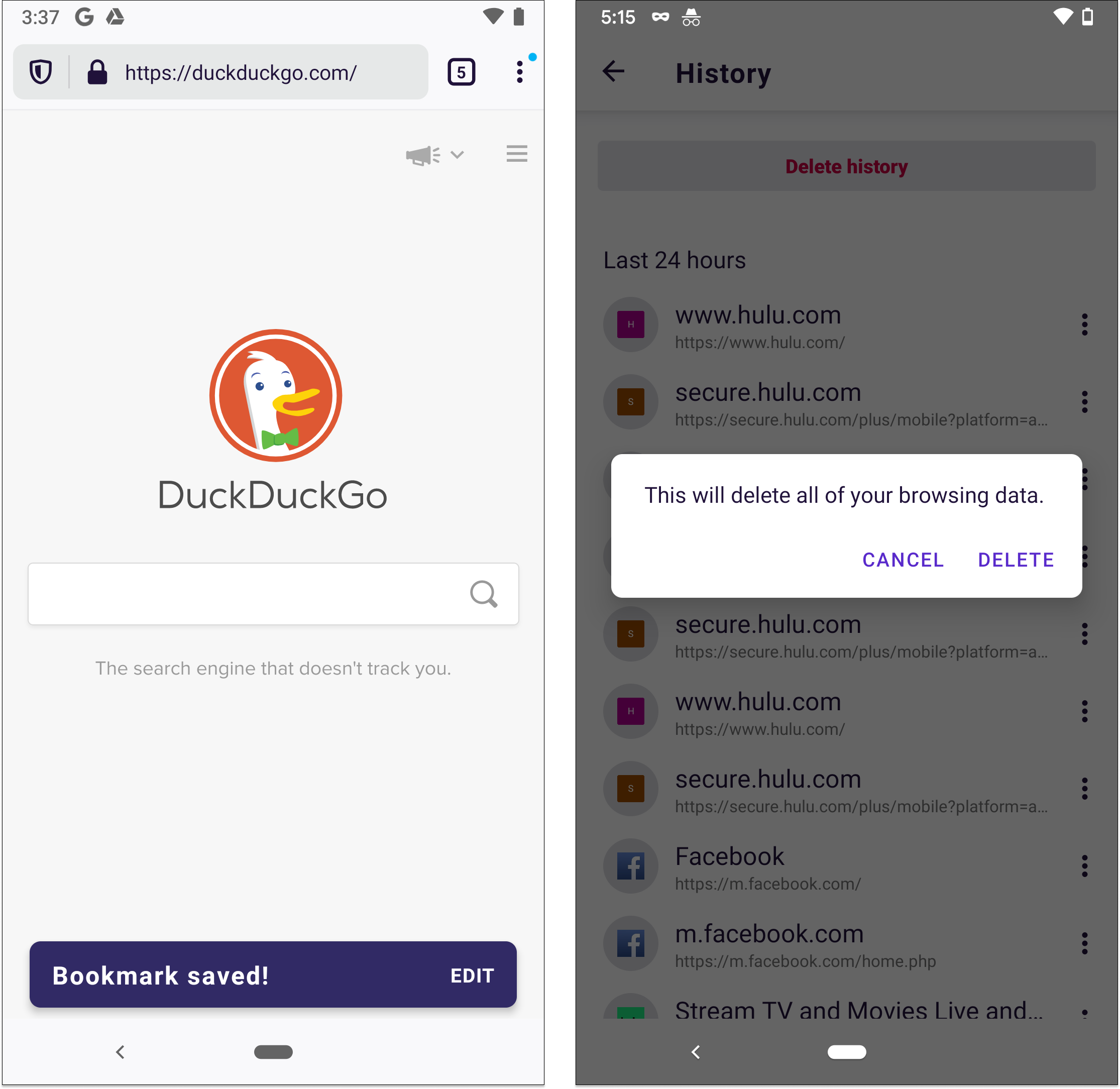
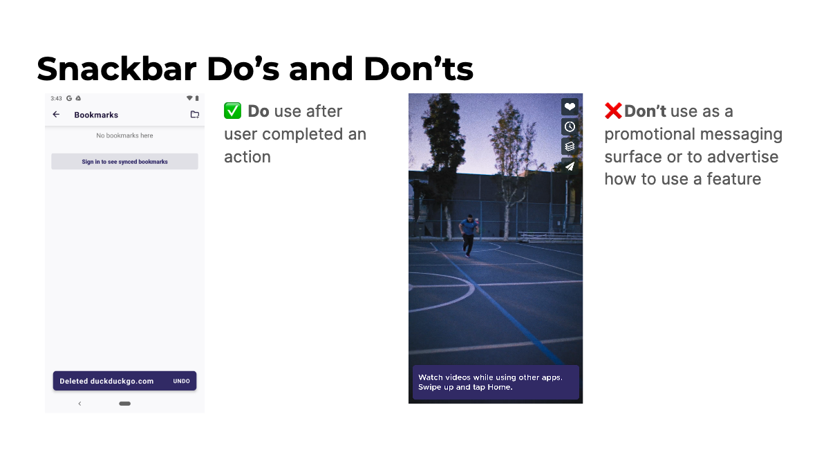
I had an immediate ask to write strings for several snackbars and confirmation dialogs. Dozens of these already existed in the app. They appear when you complete actions like saving a bookmark, closing a tab, or deleting browsing data.
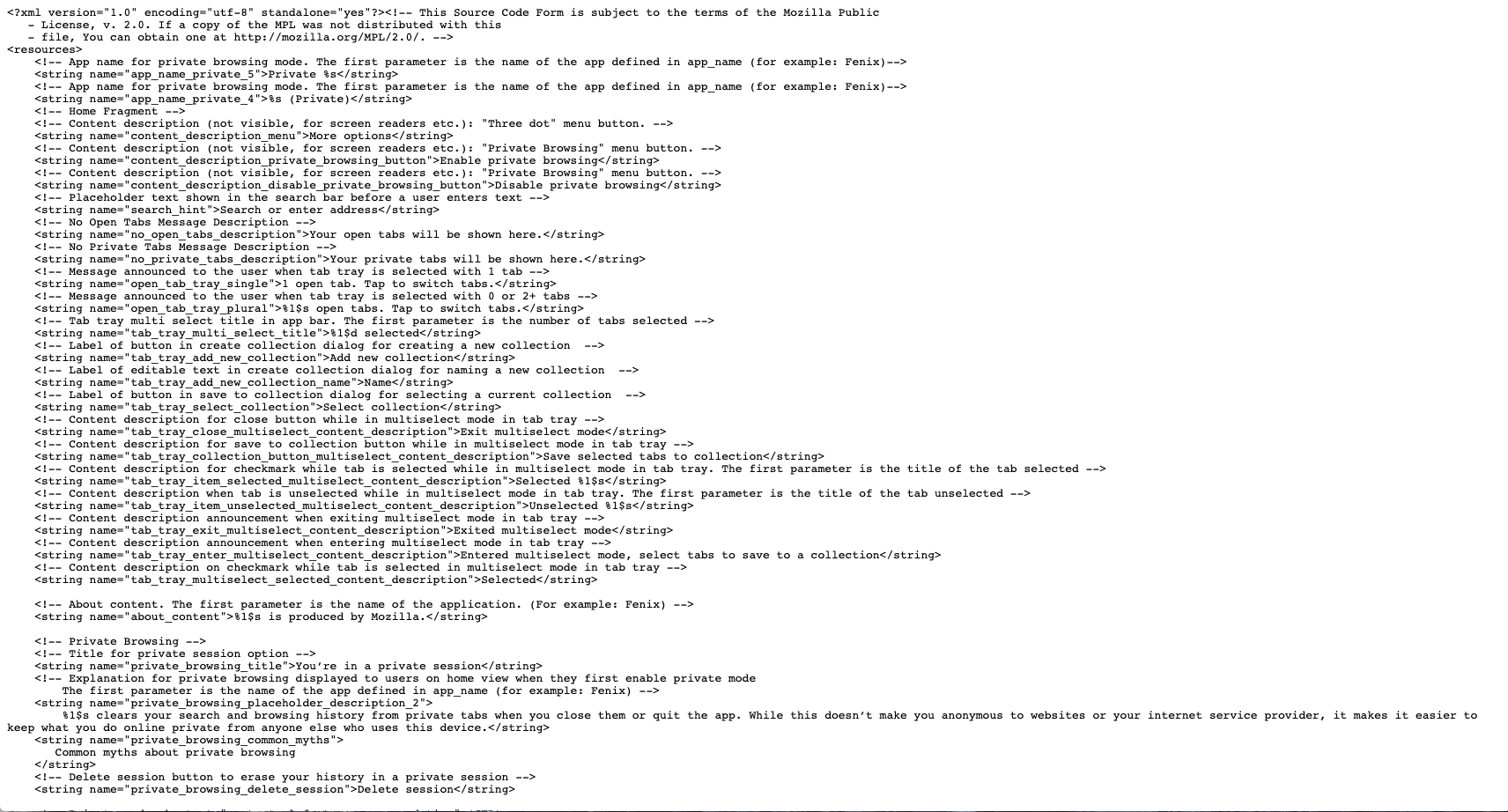
All I had to do was review the existing strings and follow the already-established patterns. That was easier said than done. Strings live in two XML files. Similar strings, like snackbars and dialogs, are rarely grouped together. It’s also difficult to understand the context of the interaction from an XML file.
To see everything in one, more digestible place, I conducted a holistic audit of the snackbars and dialogs.
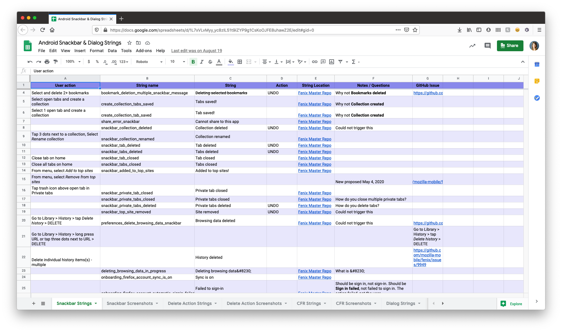
I downloaded the XML files and pulled all snackbar and dialog-related strings into a spreadsheet. I also went through the app and triggered as many of the messages as I could to add screenshots to my documentation. I audited a few competitors, too. As the audit came together, I began to see patterns emerge.
I identified the following:
• Inconsistencies in strings. Example: Some had terminal punctuation and others did not.
• Inconsistencies in triggers and behaviors. Example: A snackbar should have appeared but didn’t, or should NOT have appeared but did.
I used this to create guidelines around our usage of these components. Now when a request for a snackbar or dialog comes up, I can close the loop much faster because I have documented guidelines to follow.
Snackbars are one component of many within the app. Firefox for Android has buttons, permission prompts, error fields, modals, in-app messaging surfaces, and much more. Though the design team maintained a UI library, we didn’t have clear standards around the components themselves. This led to confusion and in some cases the same components being used in different ways.
I began to collect examples of various in-app components. I started small, tackling inconsistencies as I came across them and worked with individual designers to align our direction. After a final decision was made about a particular component, we shared back with the rest of the team. This helped to build the team’s institutional memory and improve transparency about a decision one or two people may have made.
As we moved closer towards the product launch, we began to discuss which new features to add. This led to conversations around feature discoverability. How would users discover the features that served them best?
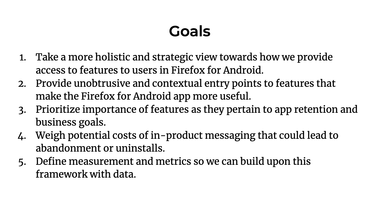
Content design advocated for a holistic approach; if we designed a solution for one feature independent of all others in the app, we could end up with a busy, overwhelming end experience that annoyed users. To help us define when, why, and how we would draw attention to in-app features, I developed a Feature Discovery Framework.
The framework serves as an alignment tool between product owners and user experience to identify the best approach for a particular feature. It’s broken down into three steps. Each step poses a series of questions that are intended to create clarity around the feature itself.
After I had developed the first draft of the framework, I shared in our UX design critique for feedback. I was surprised to discover that my peers working on other products in Firefox were enthusiastic about applying the framework on their own teams. The feedback I gathered during the critique session helped me make improvements and clarify my thinking. On the mobile team, we’re now piloting the framework for future features.